What MuniciPay Data Reveals About Online Payment Adoption
Can Payers Find Your Online Payment Link?
Offering online payments is only the first step
A government office can offer online payments and still see limited adoption if payers cannot quickly find the payment link. Small text, unclear labels, hidden links, buttons that don’t look like buttons, links in secondary pages, links located lower on a page, and extra navigation steps can make an available service feel difficult to access.
Autoagent analyzed 110 tax offices that had used MuniciPay for a full 12 months. The study compared the percentage of bills paid online against the entire bill set, and examined several possible explanations for differences in adoption, including credit card and ACH fees, jurisdiction’s median age and household income, jurisdiction size, and payment-link placement.
What the data indicates
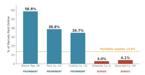
Adoption ranged from 0.9% to 58.8%, with a portfolio median of 13.6%. In the analysis, credit card or ACH fees, population median age or household income, and jurisdiction size did not explain the adoption gap. ACH fees or free ACH showed minimal effect. Payment-link clarity and placement was the clearest factor separating higher vs lower adoption of online payments.
The findings are tangible. Government offices websites with prominent links recorded adoption rates of 58.8%, 38.8%, and 34.7%. Two office websites with buried or unclear links recorded 3.0% and 4.1%.
These examples do not mean that moving a link will produce the same result for every government office. They do suggest that visibility is a practical factor government offices can review and improve. When the payment option looks clickable, uses direct wording, appears prominently on the homepage, and leads to the MuniciPay shopping cart through a short route, payers have a clearer next step and are less likely to abandon the payment process.
Five ways to make the payment path clearer
- Use a button or banner that is visually distinct and easy to tap.
- Choose direct wording such as “Pay Your Taxes”, “Pay Your Bill”, “Make a Payment”, “Pay Tickets” – closing the gap between the user’s goal and your wording.
- Place the option on the homepage where it is visible without scrolling. Avoid the user having to scroll down.
- Link to the appropriate MuniciPay payment portal entry point.
- Where policy and requirements allow, present one clear online payment path, not several options.
Review the website on both a computer and a phone. If the payment option is not immediately obvious, update the label, placement, or route.
Make the next step easy to see
The analysis found that payment-link visibility was the clearest adoption factor examined. A prominent, clearly labeled and well positioned button ot link can remove unnecessary friction and help your payers find the online option already available to them. Allowing more of your payers to use your MuniciPay product will bring savings, accuracy and velocity to your revenue collections. If you are not sure how to improve your payment link let us know by reaching out to our incredible support team. We can help.